Santa Rosa Junior College + SRJC Foundation
Santa Rosa Junior College + SRJC Foundation
Santa Rosa Junior College is a 100 year old community college with six campuses, each with unique programs and personalities. We developed a brand identity for the college as a whole as well as each individual campus. Prior to our work, the campuses were not branded.
We provided SRJC with a brand style guide clearly outlining positioning, copy guidelines, typography standards, color palette, illustration guidelines and photographic styles for the college and each campus. By creating this tiered system, we gave SRJC the tools to design communications that are consistent, clear and efficient.
Santa Rosa Junior College Foundation later approached us for a rebranding project. We created a brand for the Foundation that is independent, but clearly linked to Santa Rosa Junior College.
Scope
Branding
Print Design
College logo
College Branding
We talked to students, faculty and staff from each campus, which revealed the diverse reasons students chose SRJC for their education. Whether preparing to transfer to a four-year university or looking to switch careers or update skills, there's no such thing as one size fits all education at SRJC. The insights we learned became core of the college's Learn Your Way messaging. We augmented the college's established color palette with bold accent colors, crisp icons and warm, friendly, action oriented photography that prioritized the student experience.
Logo + Tagline
Icon
Typography
College Palette
Campus colors
Styleguide
Marketing Materials
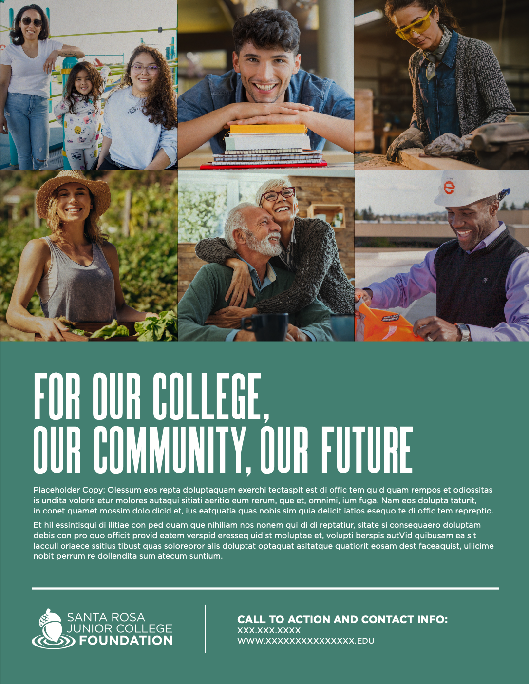
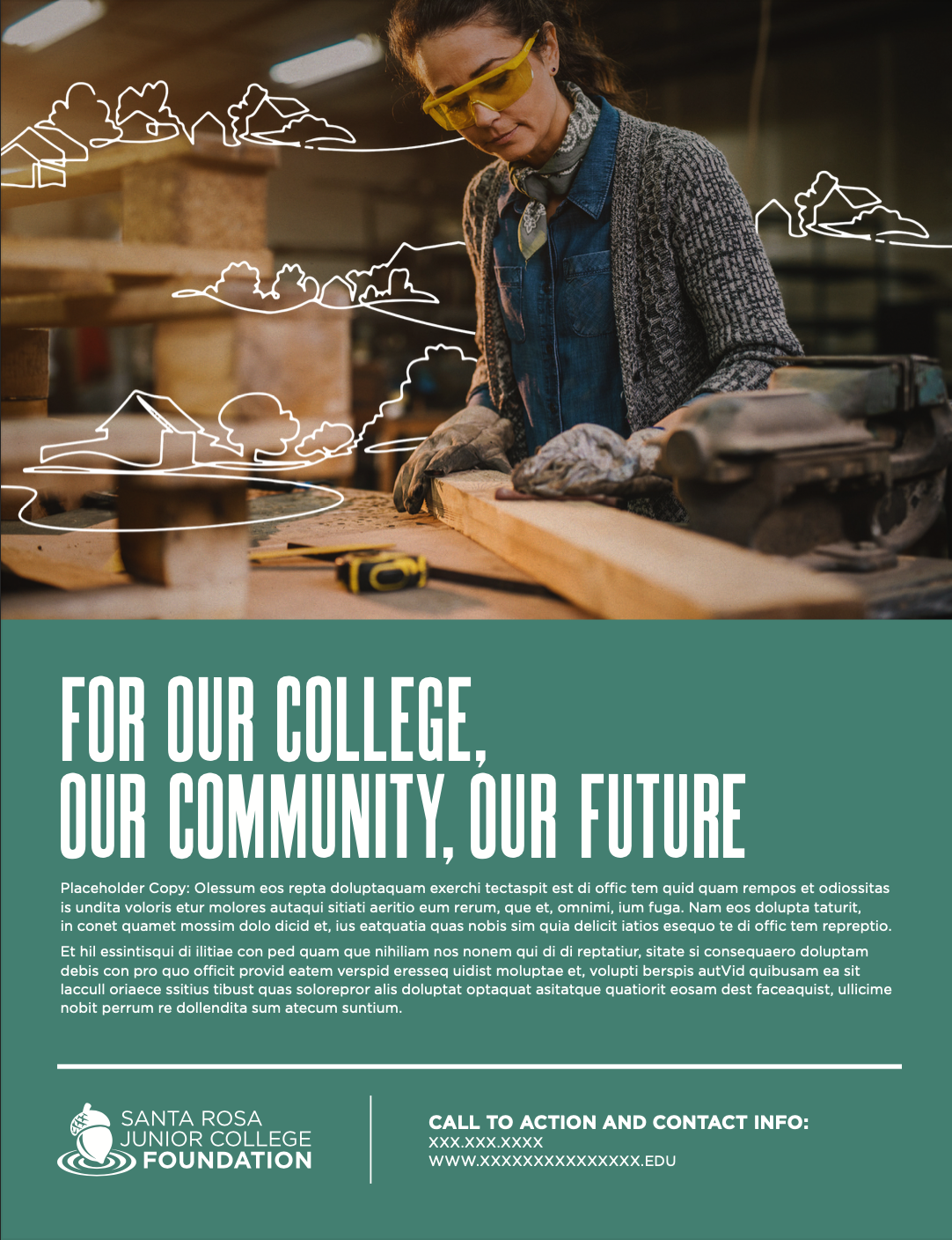
Advertising concepts and print mock-ups were designed to show how the brand positioning for the college as a whole - Learn Your Way - works with the campus-specific branding to establish a layered, yet cohesive, understanding of the college. The photography focuses on portraits of students with diverse motivations and inspiration for attending the college while the use of illustrated overlays provides additional detail and character.
Foundation Logo
Foundation Branding
We used a tiered branding approach, with each of the six campuses having its own branding that communicates its unique message while remaining consistent with the overall SRJC brand. With complimentary yet unique colors and logo treatments, each campus has a distinct identity that fits seamlessly into the SRJC brand and the Learn Your Way messaging.


